FULLOUTPUT 77
FULLOUTPUT 77
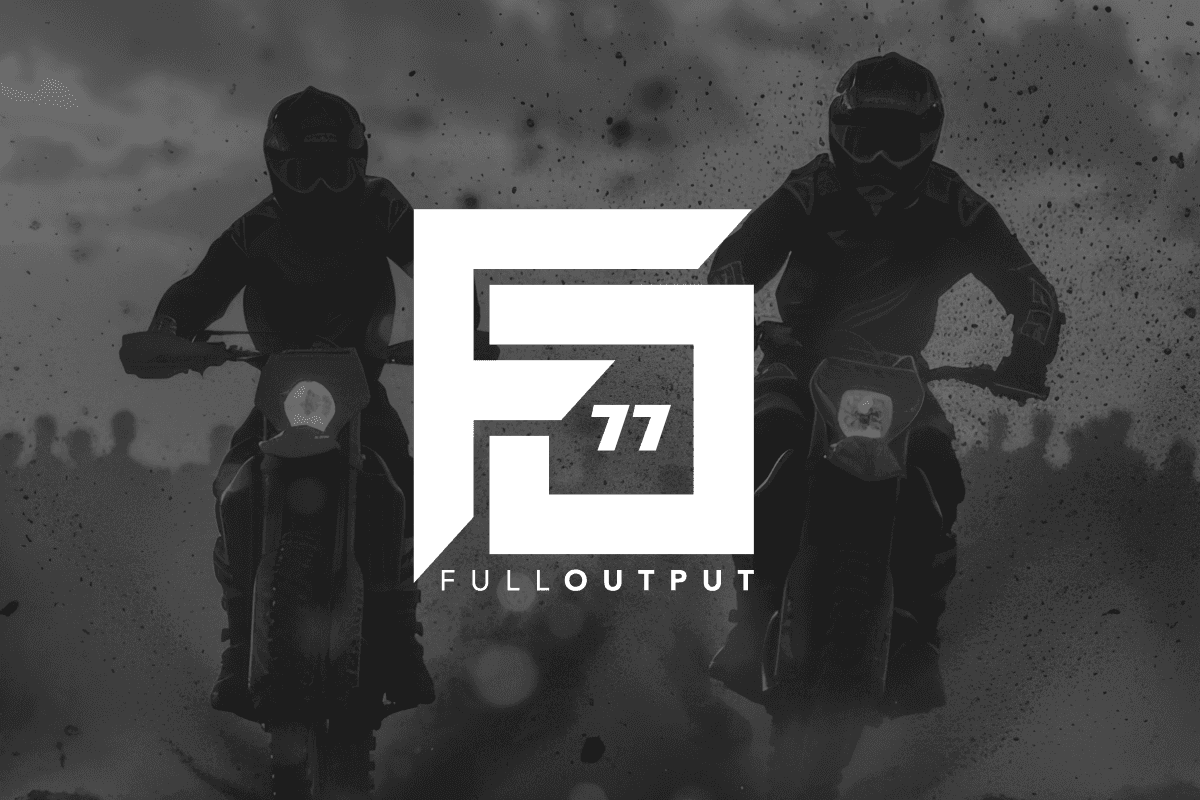
Fulloutput 77 is a leading sticker kits company, specialising in high-quality custom graphics for all vehicles from motorcycles to jet ski's, and more.
Client
FullOutput77
Year
2025
Category
Logo Design
Research
Research
Before designing the logo, the first step would be defining Full Output's brand personality and values:
Industry: Motorsports, sticker kits, extreme sports
Personality: Bold, aggressive, high-performance
Core Themes: Speed, precision, customisation, and adrenaline
Target Audience: Riders, racers, off-road enthusiasts, and those who customise bikes/cars
The "FullOutput" name itself suggests maximum performance, no limits, and pushing boundaries, so the logo needed to visually reflect that.
Research
Before designing the logo, the first step would be defining Full Output's brand personality and values:
Industry: Motorsports, sticker kits, extreme sports
Personality: Bold, aggressive, high-performance
Core Themes: Speed, precision, customisation, and adrenaline
Target Audience: Riders, racers, off-road enthusiasts, and those who customise bikes/cars
The "FullOutput" name itself suggests maximum performance, no limits, and pushing boundaries, so the logo needed to visually reflect that.
Design
Design
A study of motorsports and extreme sports brands helped shape the logo’s design. Some key takeaways from industry leaders:
Brands like KTM, Fox Racing, 100%, and Monster Energy use strong, angular, or aggressive typefaces that create a sense of movement.
Sticker kit brands like Kiff Ideas, Backyard Designs, and ByKleyn tend to have bold, high-contrast logos that stand out on bikes and gear.
Minimalist, geometric designs (like AlpineStars and Troy Lee Designs) help logos remain recognisable even in small sizes.
Neon and high-contrast colours are commonly used to enhance visibility on race tracks and outdoor environments.
Key Insight: The logo needed to be bold, readable from a distance, and adaptable for stickers, merchandise, and digital branding.easily
Design
A study of motorsports and extreme sports brands helped shape the logo’s design. Some key takeaways from industry leaders:
Brands like KTM, Fox Racing, 100%, and Monster Energy use strong, angular, or aggressive typefaces that create a sense of movement.
Sticker kit brands like Kiff Ideas, Backyard Designs, and ByKleyn tend to have bold, high-contrast logos that stand out on bikes and gear.
Minimalist, geometric designs (like AlpineStars and Troy Lee Designs) help logos remain recognisable even in small sizes.
Neon and high-contrast colours are commonly used to enhance visibility on race tracks and outdoor environments.
Key Insight: The logo needed to be bold, readable from a distance, and adaptable for stickers, merchandise, and digital branding.easily
Development
Development
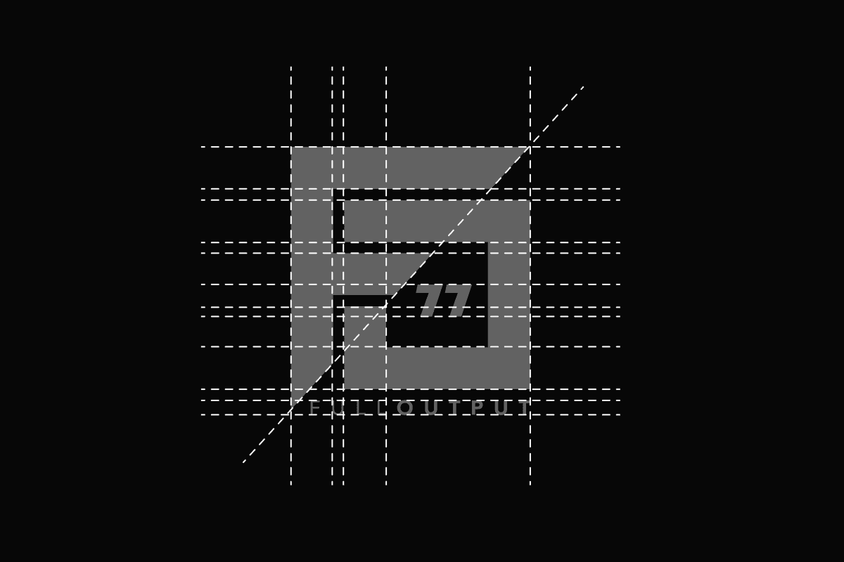
Various font styles were tested, including sharp angular, blocky, and futuristic fonts.
Early concepts included speed-inspired elements, such as slashes, italicized text, and aerodynamic cuts.
Symbol-based ideas (like checkered flags, tire marks, or lightning bolts) were explored but may have been too generic.
Key Decision: The final design would focus on a custom wordmark, making it clean, bold, and instantly recognizable.
Development
Various font styles were tested, including sharp angular, blocky, and futuristic fonts.
Early concepts included speed-inspired elements, such as slashes, italicized text, and aerodynamic cuts.
Symbol-based ideas (like checkered flags, tire marks, or lightning bolts) were explored but may have been too generic.
Key Decision: The final design would focus on a custom wordmark, making it clean, bold, and instantly recognizable.
Concept
Concept
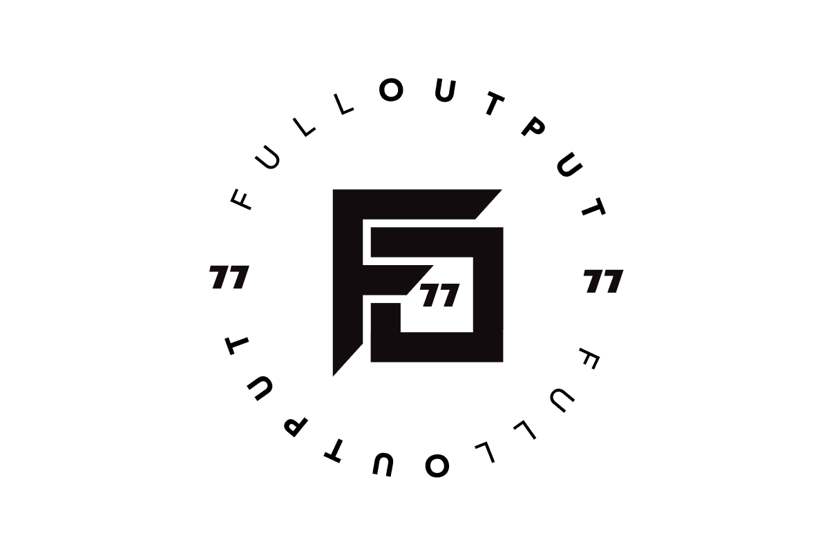
The bold, angular design of the "F" and "O" (from FullOutput) gives a sense of speed, movement, and precision—key traits for a brand in motorsports and extreme sports.
The number "77" integrated within the design adds a competitive or personal brand touch.
The geometric nature of the logo feels industrial and mechanical, fitting for a sticker kit and racing-related brand.
The squared-off "F" and "O" create a structured yet aggressive look, reinforcing the high-adrenaline theme.
The black-and-white primary version creates a strong contrast, making it adaptable across different mediums.
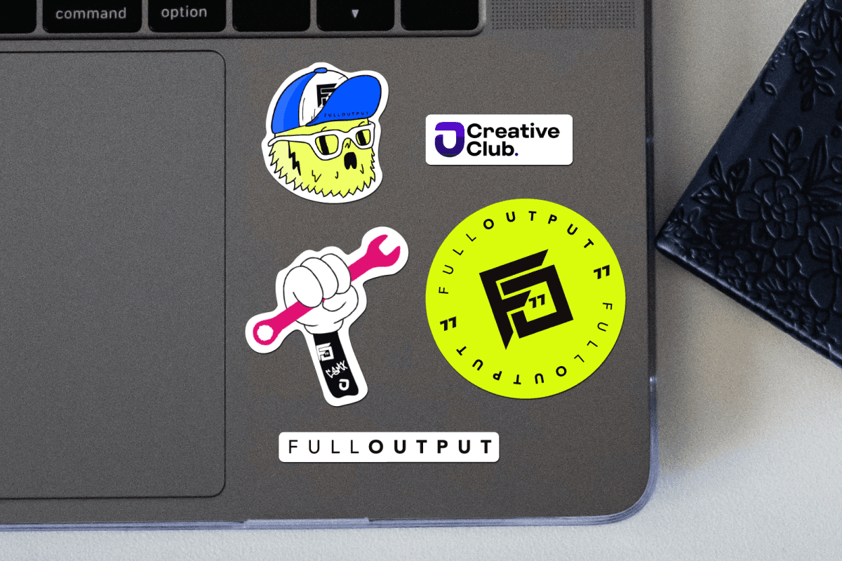
The neon yellow variation (as seen on the sticker) gives it a bold, high-visibility appeal, ideal for motorsports gear, bikes, and merchandise.
The bold, angular design of the "F" and "O" (from FullOutput) gives a sense of speed, movement, and precision—key traits for a brand in motorsports and extreme sports.
The number "77" integrated within the design adds a competitive or personal brand touch.
The geometric nature of the logo feels industrial and mechanical, fitting for a sticker kit and racing-related brand.
The squared-off "F" and "O" create a structured yet aggressive look, reinforcing the high-adrenaline theme.
The black-and-white primary version creates a strong contrast, making it adaptable across different mediums.
The neon yellow variation (as seen on the sticker) gives it a bold, high-visibility appeal, ideal for motorsports gear, bikes, and merchandise.
Concept
The bold, angular design of the "F" and "O" (from FullOutput) gives a sense of speed, movement, and precision—key traits for a brand in motorsports and extreme sports.
The number "77" integrated within the design adds a competitive or personal brand touch.
The geometric nature of the logo feels industrial and mechanical, fitting for a sticker kit and racing-related brand.
The squared-off "F" and "O" create a structured yet aggressive look, reinforcing the high-adrenaline theme.
The black-and-white primary version creates a strong contrast, making it adaptable across different mediums.
The neon yellow variation (as seen on the sticker) gives it a bold, high-visibility appeal, ideal for motorsports gear, bikes, and merchandise.
More Works More Works
More Works More Works

Keely-Jo Londt
Go Back To Top
Keely-Jo Londt
Go Back To Top